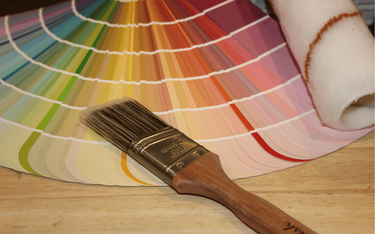
For homeowners and design-forward buyers in Silver Lake, California—a neighborhood known for its architectural creativity and vibrant cultural identity—selecting the right paint colors for a home is more than a visual decision. It’s a strategic one. Understanding how to choose colors for a room is rooted in both the science of color psychology and the practical function of each space. The right color palette can enhance natural light, define the mood, improve spatial flow, and ultimately increase a home’s livability and value.
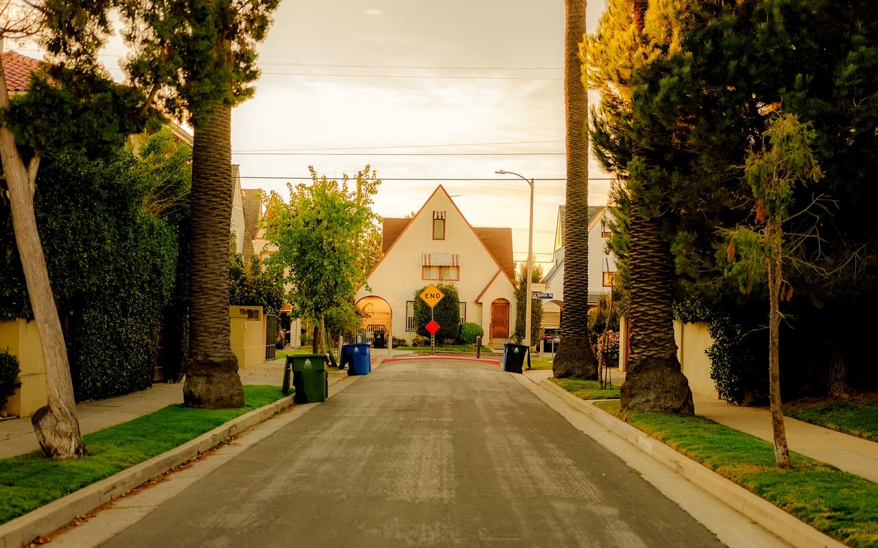
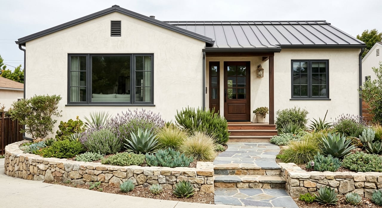
Silver Lake homes span a range of styles, from minimalist mid-century moderns to bold Spanish revivals and new-construction contemporary builds. Each property offers an opportunity to use color to highlight architectural features, complement surrounding landscapes, and create interiors that reflect personality without overwhelming the senses. Knowing how to apply color theory can guide homeowners through thoughtful, lasting decisions that serve aesthetic and emotional purposes.
Understanding the Psychology Behind Color
The foundation of learning how to choose colors for a room begins with color psychology—the study of how hues influence perception, emotion, and behavior. Warm colors like reds, oranges, and yellows tend to energize and stimulate, making them effective in areas meant for socializing or activity. Cool colors such as blues, greens, and purples promote calmness and concentration, well-suited to bedrooms, bathrooms, or home offices. Neutrals like grays, beiges, and whites offer versatility, allowing for easy layering and a timeless look.
In a high-design neighborhood like Silver Lake, where many homes double as creative workspaces or artist studios, color selection becomes an extension of both function and personal expression. A dining room in a home with views of the hills might benefit from rich, saturated earth tones that mirror the exterior landscape, while a north-facing bedroom with limited light may require soft, warm neutrals to brighten and expand the space.
Color can also impact perceived room size. Lighter colors reflect light and make rooms feel larger, while darker tones absorb light, offering intimacy and depth. The psychological response to color is not universal but can be guided by research and fine-tuned to individual preference, especially when curated alongside architectural style and natural lighting.
How Lighting Impacts Color Perception
Natural and artificial lighting have a significant impact on how paint colors appear in a space. This is a key consideration in learning how to choose colors for a room, particularly in homes like those found in Silver Lake, where large windows, skylights, and indoor-outdoor transitions are common architectural features.
South-facing rooms receive the most consistent natural light throughout the day, which means most colors will appear true to their swatches. East-facing rooms, which get strong morning sun, are ideal for warm tones that glow in soft light. West-facing rooms often receive intense afternoon light that can amplify warmer hues, so homeowners might prefer muted shades to prevent overpowering brightness. North-facing rooms have the coolest light and may cause colors to appear more subdued—here, warmer undertones can help compensate for the lack of natural warmth.
Artificial lighting must also be factored into the equation. LED bulbs with cooler temperatures can make blues feel stark, while incandescent lighting tends to enhance warm tones. In Silver Lake homes with layered lighting schemes—combining task, ambient, and accent lighting—color selection must take into account how each source affects the room at different times of day.
Testing swatches in varying light conditions and observing their effect across a 24-hour cycle is an essential step in choosing the right palette. Paint samples directly on the wall, rather than relying solely on paper swatches, provide the most accurate preview of the final result.
Coordinating Color Flow from Room to Room
While each room can have its own distinct personality, consistency in tone and undertone creates cohesion throughout the home. Color flow, or the way one room transitions into another, is a central concept in understanding how to choose colors for a room effectively.
In open-concept homes, a unified color palette with subtle variation ensures visual harmony. For example, a pale taupe in the living room may shift into a deeper mocha in the adjoining dining space, while maintaining the same warm undertone. This technique allows for room definition without abrupt or jarring shifts in mood.
Homes with defined rooms and hallways—common in many classic Silver Lake layouts—offer more flexibility for bold statements or contrasting tones. A tranquil, dusty blue in the bedroom might be balanced by a crisp, clean white in the bathroom. The key is to maintain a consistent undertone family (warm or cool) so the colors feel related, even if their saturation or hue differs.
Trim and ceiling colors play an important supporting role. Crisp white or soft greige trim can serve as a unifying element, while painted ceilings—known as the “fifth wall”—can either disappear into the background or act as a design feature, depending on the tone selected.
Functional Considerations for Each Room
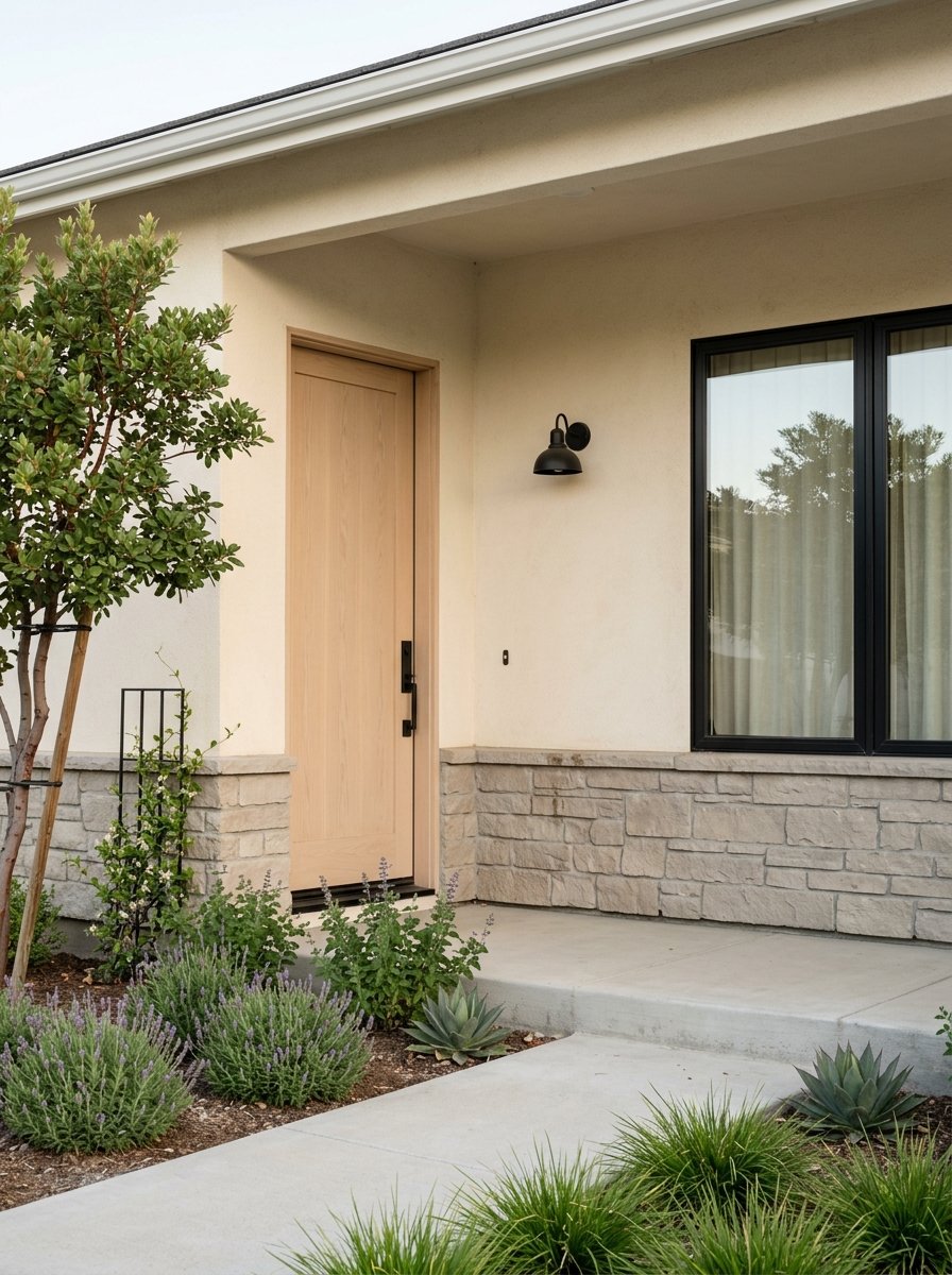
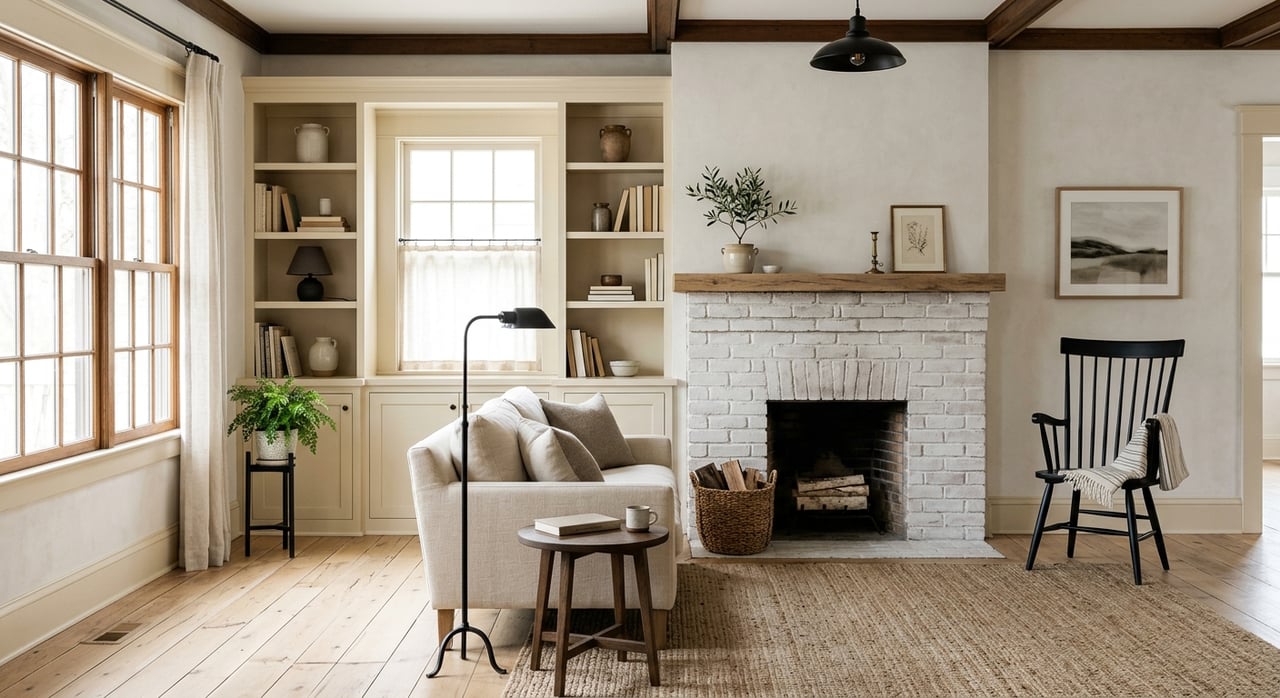
Each room in the home serves a unique purpose, and paint colors should be chosen to support that function. In living rooms and common areas, warm neutrals or mid-toned earth shades like sand, clay, or sage offer a welcoming atmosphere while allowing for flexible décor choices. These tones work especially well in Silver Lake’s diverse architectural interiors, from high-ceilinged contemporary spaces to historic bungalows with original woodwork.
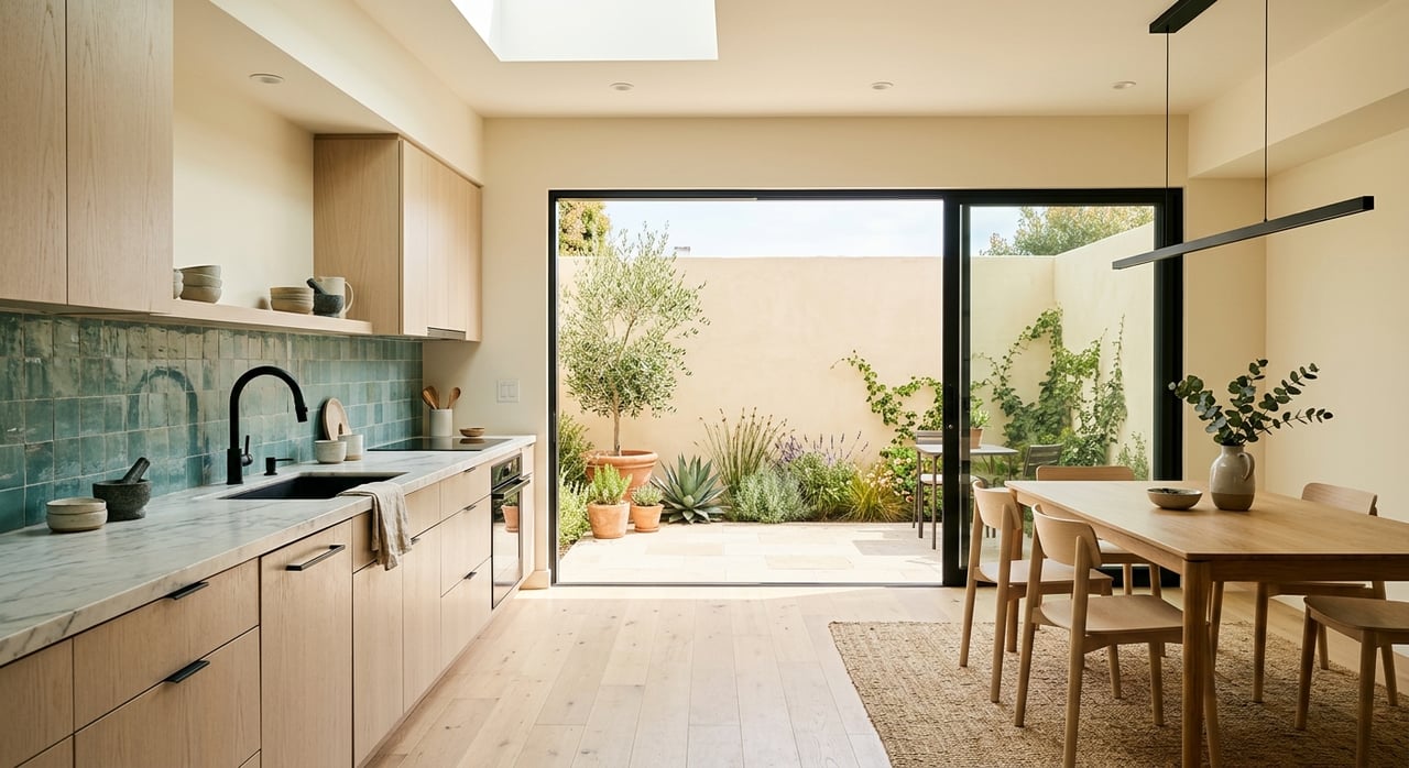
In kitchens, color choice should consider both light reflection and the finish of cabinetry, countertops, and flooring. Soft whites, pale greens, or even dramatic charcoal tones can work beautifully when balanced with warm metallic fixtures or natural stone surfaces. Bathrooms often benefit from spa-inspired palettes—think soft blues, pale grays, or muted blush tones—to enhance relaxation and cleanliness.
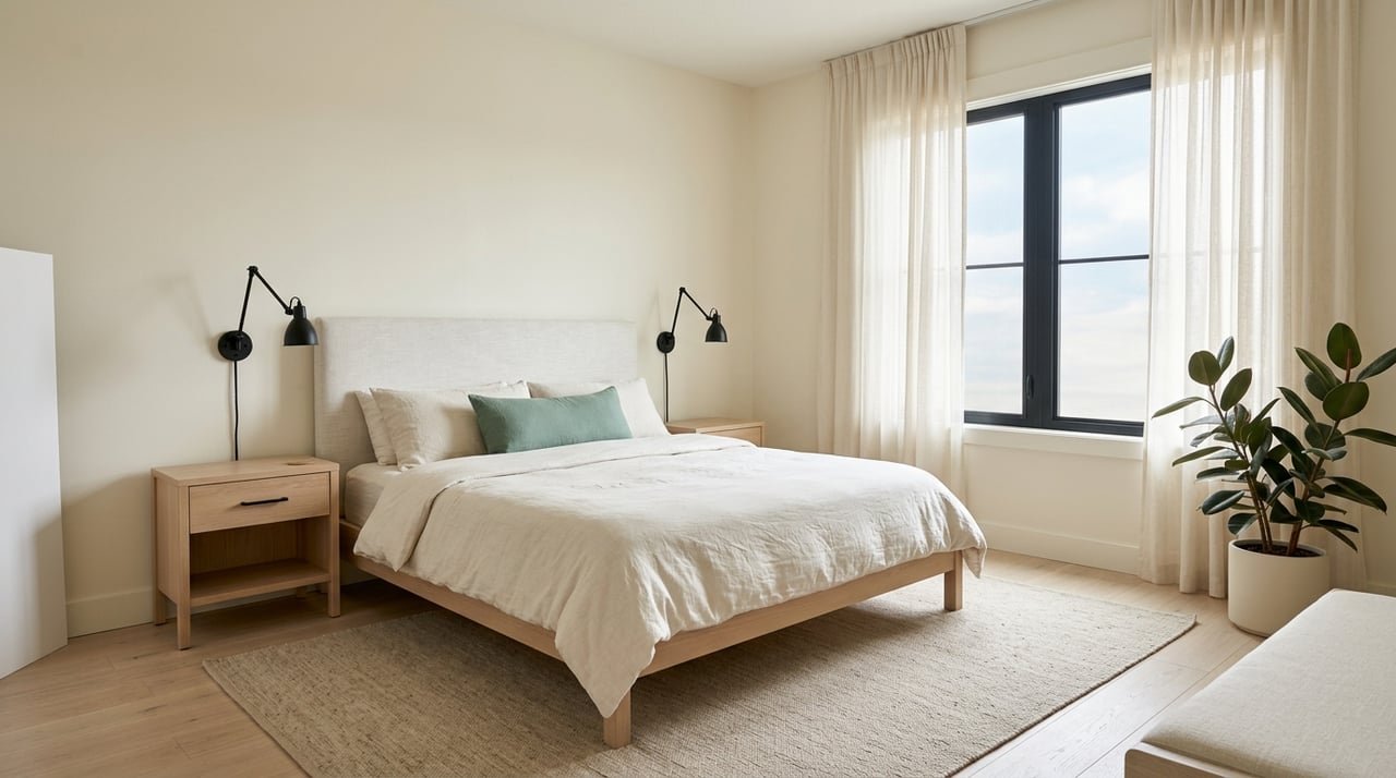
Bedrooms, particularly primary suites, benefit from cool or muted tones that promote rest. Dusky lavender, slate blue, and soft greige all create serene environments. For children's rooms or creative workspaces, bolder color choices can add personality and inspiration, though using more vibrant hues on accent walls rather than entire rooms can help maintain flexibility as tastes evolve.
Home offices—now a permanent fixture in many households—should strike a balance between calm and focus. Light sage, slate, or warm neutrals support concentration while remaining aesthetically pleasing on video calls and work-from-home days.
Trends vs. Timelessness in Color Selection
While color trends shift each year—often influenced by fashion, culture, and design—choosing paint tones that have lasting appeal ensures your home stays current without frequent repainting. Understanding how to choose colors for a room includes knowing when to embrace trend-forward shades and when to lean into timeless classics.
In recent years, earthy neutrals, rich greens, and desert-inspired tones have dominated interior design palettes, all of which complement Silver Lake’s natural surroundings and architectural textures. These colors offer a modern yet grounded aesthetic, appealing to today’s design-savvy buyers without feeling too fleeting.
Still, timeless shades like ivory, soft gray, navy, and taupe continue to be reliable choices. These colors provide a flexible backdrop for evolving furnishings and personal style while maintaining broad market appeal. For homeowners considering resale, neutral and nature-inspired tones are often best, creating inviting spaces that allow buyers to visualize their own tastes.
Trevino Properties Can Help You Discover How to Choose Colors for a Room
Choosing the right paint palette isn’t just a matter of personal taste—it’s an art and a science that impacts mood, perception, and property value. Understanding how to choose colors for a room involves assessing light, function, flow, and psychology. For homeowners in Silver Lake, where style and individuality are part of the community identity, color selection offers a unique opportunity to make a house feel like home. For personalized advice on preparing your home for sale or creating the perfect aesthetic in your next property,
contact Trevino Properties and let their experienced team help guide your design journey with expertise and local insight.